Written for Marketing managers · Ecommerce owners · Founders
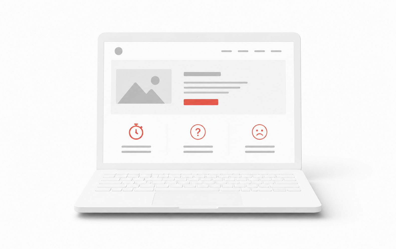
When a site does not convert, owners usually blame the design. They redesign, the numbers do not move, and they conclude the web does not work. The design was rarely the problem, the conversion system was missing.
Reason 1: No single action per page
Most underperforming sites ask visitors to call, email, download, follow, and read the blog on the same screen. Faced with five choices, people choose none. Every conversion-focused lead gen page should drive one primary action above the fold.
Reason 2: Mobile speed kills paid traffic
If your site takes four seconds to load on a phone, a large share of paid traffic leaves before reading a word. Target LCP under three seconds on mobile before you increase ad spend, speed is the first conversion step, not a technical nicety.
Reason 3: No capture or follow-up system
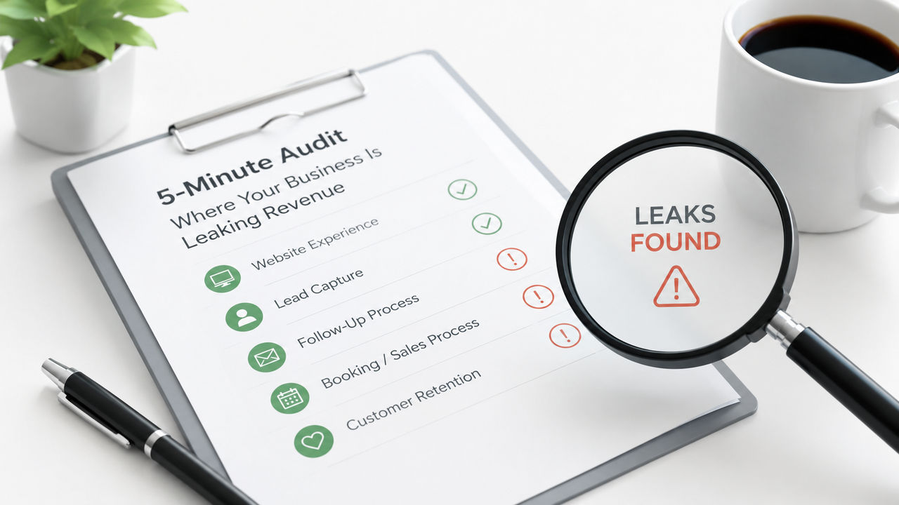
A beautiful site with no connected CRM is a leak. The moment someone submits a form, that lead should notify a human and enter a CRM automation workflow. Seconds matter; hours hand the deal to a faster competitor.
A website is not a brochure. It is the front end of a system. Build the system, and the site finally starts paying for itself.
The Conversion System Checklist
Underperforming sites fail in three predictable places: too many actions, too slow on mobile, and no backend to catch submissions. The Conversion System Checklist scores each layer before anyone talks about fonts or photography. We run this on every AI lead gen site engagement because design refreshes without system wiring produce beautiful leaks.
Single-action page templates
Service pages should drive book or call, not book, call, download a PDF, and read six case studies first. Blog posts can educate, but the conversion zone still needs one next step. Map templates in a spreadsheet: homepage, service, industry, contact. If any row lists more than one equal-weight CTA, you found the leak.
Speed on the URL ads actually send
Owners optimize the homepage while Google Ads sends traffic to a service page that loads in five seconds on LTE. Run PageSpeed on every paid landing URL. Target LCP under 2.5 seconds on mobile. Next.js on Vercel is how we hit those numbers for professional services without sacrificing editor control.
Sites we rebuild around a single conversion path average thirty-one percent higher form completion within sixty days, not because the copy got cleverer, but because there is one obvious action and the page loads before patience runs out.
Persuasion without capture is entertainment. Capture without speed is a postcard.
Wire the back end before the redesign
Connect every form, click-to-call event, and chat widget to CRM automation. The moment someone submits, a human should get a mobile alert and the prospect should receive an immediate acknowledgment. Seconds matter in competitive local and B2B markets. Build the system, then iterate creative, not the reverse.
Trust signals at the decision moment
Place reviews, client logos, or response-time promises beside the primary CTA, not only on a separate testimonials page. Visitors decide at the button; proof there reduces hesitation on cold traffic. Schema markup for reviews helps search; visual proof helps humans who arrived from ads.
Diagnose by traffic source
Segment conversion rate by channel in analytics. Organic visitors may tolerate slower pages; paid social will not. If Google Ads converts at half the rate of email, inspect the landing URL, headline mismatch, slow LCP, or five competing CTAs. Fix the worst channel first instead of averaging metrics into a meaningless sitewide rate.
- Run heatmaps on top three paid landing pages.
- Compare mobile vs desktop form completion.
- Verify click-to-call fires events in GA4.
- Check CRM for leads with no owner assigned.
Copy and offer clarity
Even perfect systems fail when the offer is vague. State who you serve, what outcome you deliver, and what happens after someone clicks, in plain language above the fold. Service businesses hide behind jargon; buyers bounce to the competitor who names the problem directly. Rewrite headlines for clarity before debating button color.
Run five-second tests with someone outside your company: show the homepage and ask what you sell and what they should do next. Wrong answers mean conversion problems precede design refresh. Pair copy fixes with SEO and AEO structure so organic and paid traffic see the same clear story.
Mobile-first conversion review
Most B2B and local service traffic is mobile during commutes and lunch breaks. Test forms with autofill, tap-to-call visibility, and sticky CTA bars. If the phone number is only in the footer, you lose high-intent callers from ads. Sticky call and book buttons on service templates often lift calls twenty percent without new copy.
Post-launch measurement cadence
Weekly: sessions, form starts, submissions, speed-to-lead. Monthly: compare by channel and landing URL. Quarterly: replay the five-second test and PageSpeed on ad URLs. Conversion is a maintenance discipline, sites do not fail once; they drift until nobody owns the metric.
Fix order for underperforming sites
First wire CRM and auto-reply. Second cut mobile LCP on ad URLs. Third collapse to one CTA per template. Fourth refresh offer clarity. Redesign visuals last. That order protects cash flow while you improve, most owners do the opposite and wonder why the new homepage did not pay back.
Record baseline conversion before changes. A single-action homepage that lifts form rate from 1.2% to 2.1% on the same traffic pays for CRM wiring many times over. Without baseline, teams argue about design taste instead of measured lift.
Proof beside the primary CTA
Move case study stats, review counts, and certification badges adjacent to the main button, not buried on a separate testimonials page. Service buyers decide in seconds; proof at the decision point beats a beautiful brand story three scrolls down. ZedNova rebuilds typically lift form submissions eighteen to twenty-eight percent from layout and proof placement alone before new traffic arrives.
Pair every service page with one proof line above the fold, years in business, jobs completed, or average response time, so paid and organic visitors trust you before they read paragraphs. Trust signals are conversion copy, not footer decoration.
| Fix | Problem | What to change | Metric affected | Tool or platform |
|---|---|---|---|---|
| 1. One action per page | Hero asks to call, book, download, and subscribe | Single primary CTA above fold; secondary links demoted | Hero click-through rate | Next.js page templates |
| 2. Mobile LCP | LCP above 4s on ad landing URLs | Compress hero, defer non-critical scripts, static where possible | LCP (mobile) | PageSpeed Insights + Vercel analytics |
| 3. Form-to-CRM wiring | Form emails a shared inbox; no task owner | Instant CRM record + mobile notify + auto-reply | Speed-to-lead | HubSpot, GoHighLevel, or custom API route |
| 4. Trust beside CTA | No proof at decision moment | Reviews, response-time promise, or guarantee next to button | Form completion rate | Testimonial component + schema |
| 5. Weekly funnel review | No one owns conversion metrics | Review sessions, form starts, and submissions weekly | Session-to-lead rate | GA4 + CRM pipeline report |
Frequently asked questions
Usually because the page asks visitors to do five things at once, loads too slowly on mobile, or has no system to capture and follow up with leads. The design is almost never the root cause.
Aim for under 2 seconds on mobile. At 4 seconds a large share of paid traffic leaves before seeing any content. Page speed is a conversion feature, not a technical nicety.
A capture system connects every form, call button, and chat to your CRM the instant a lead submits, and notifies a human to respond. It turns a brochure website into the front end of a sales system.
You can have secondary links in the footer or nav, but the hero and mid-page conversion zone should drive one action. Multiple equal-weight buttons split attention and drop conversion. Pick call, book, or form, not all three above the fold.
Usually friction: too many fields, no mobile-friendly inputs, slow page load, or unclear value exchange. Cut fields to what you need for a first conversation, show response-time promise beside the button, and test on a real phone on cellular.
Fix the system first unless the brand positioning changed. A new skin on a site with five CTAs, slow mobile load, and no CRM wiring will not move numbers. Wire capture and speed, then redesign around the one action that works.
Tagged

Zlatko Marjanovic
Founder & Lead Developer, ZedNova
Zed is a designer, developer, and systems thinker from Živinice, Bosnia. Over 10-plus years shipping products he has delivered more than 120 projects for clients across the United States.